Genki
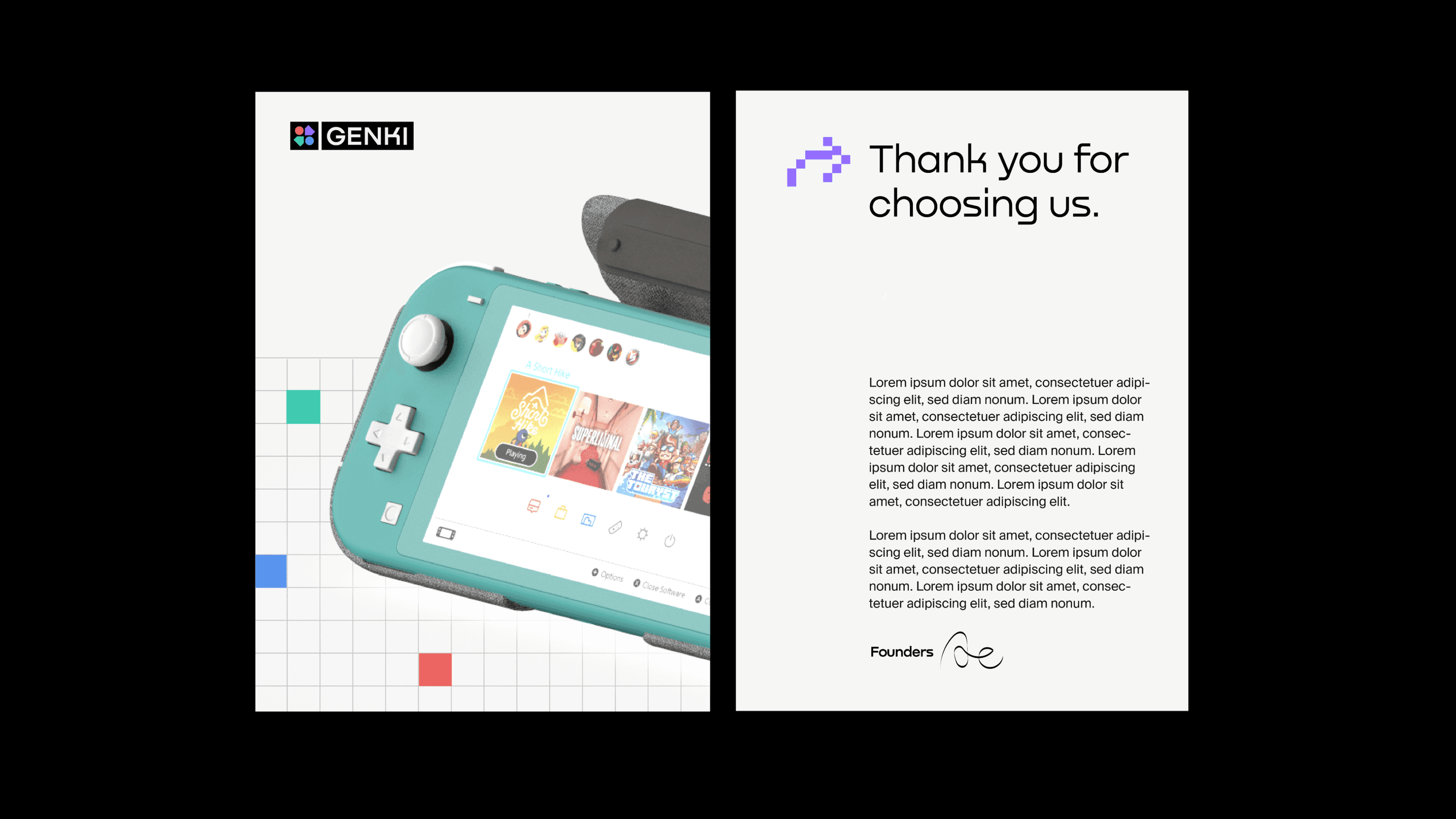
As Genki expanded beyond its core audience, its brand needed to evolve. The rebrand introduced a more gamer-centric identity that better reflected the company’s vision while connecting with a wider community.
The Brand Mark
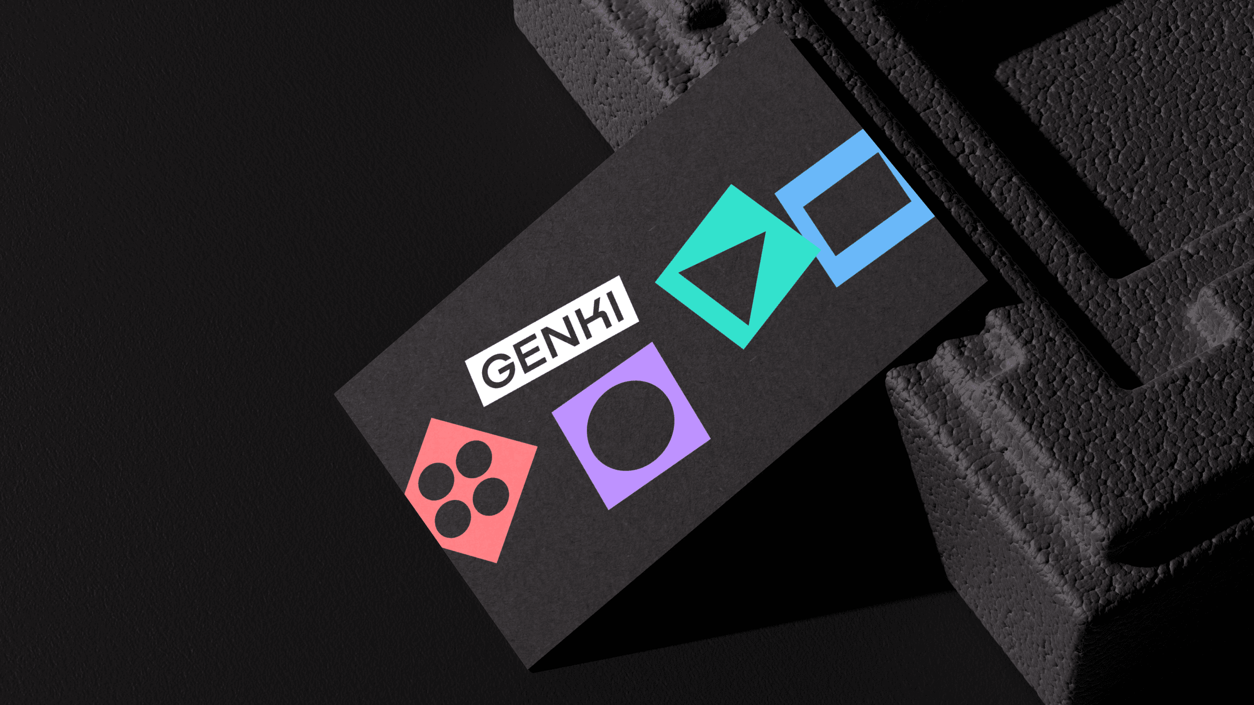
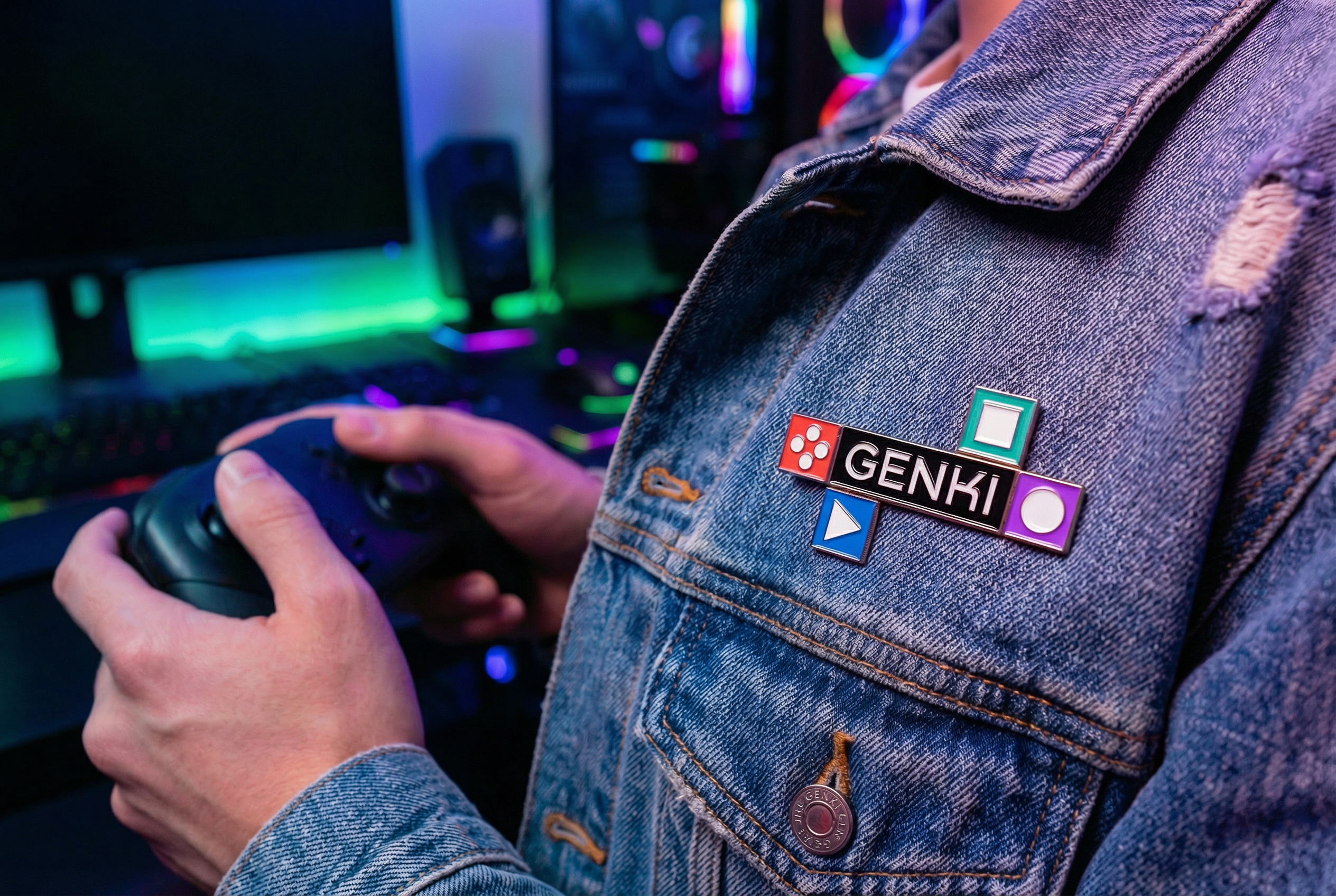
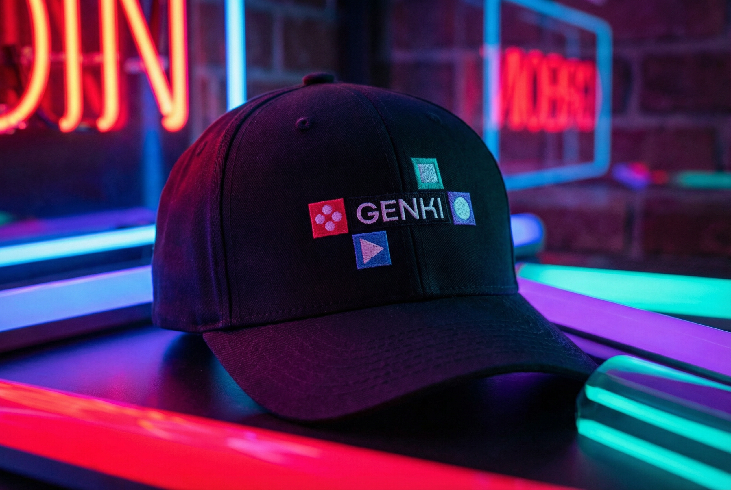
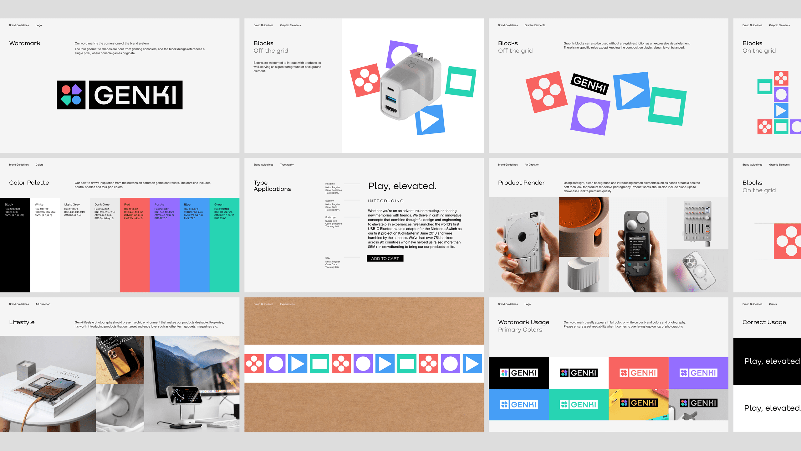
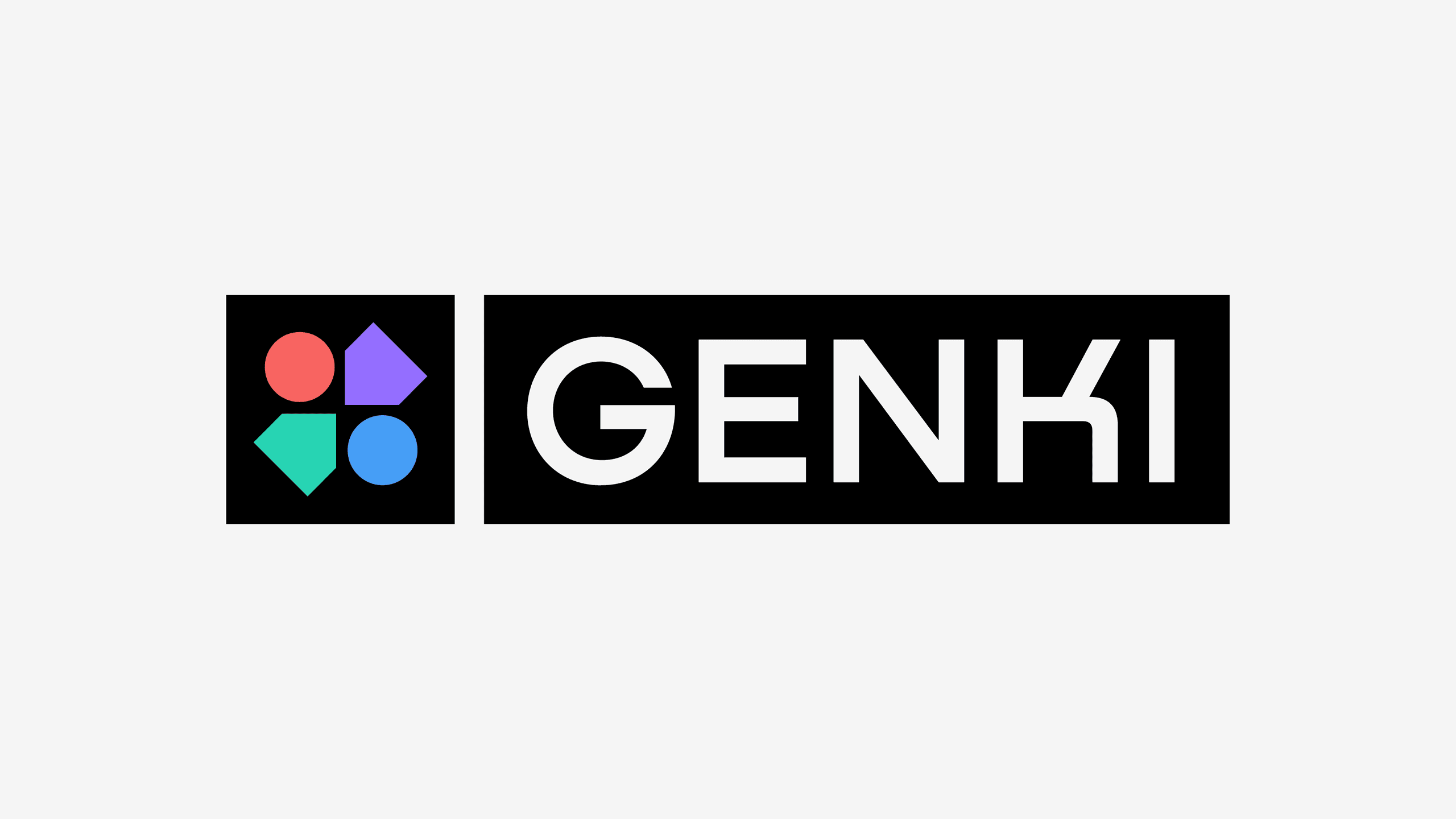
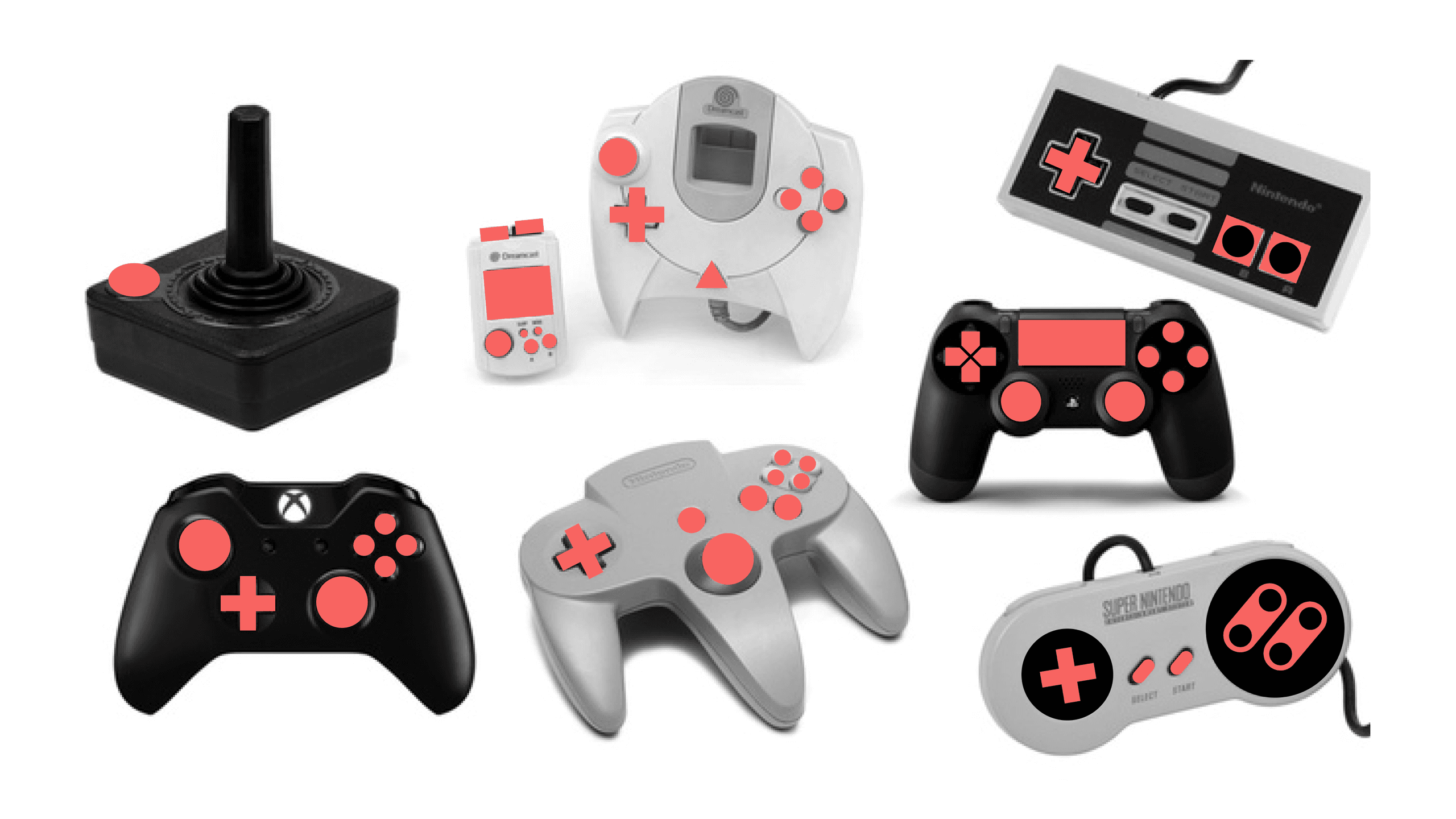
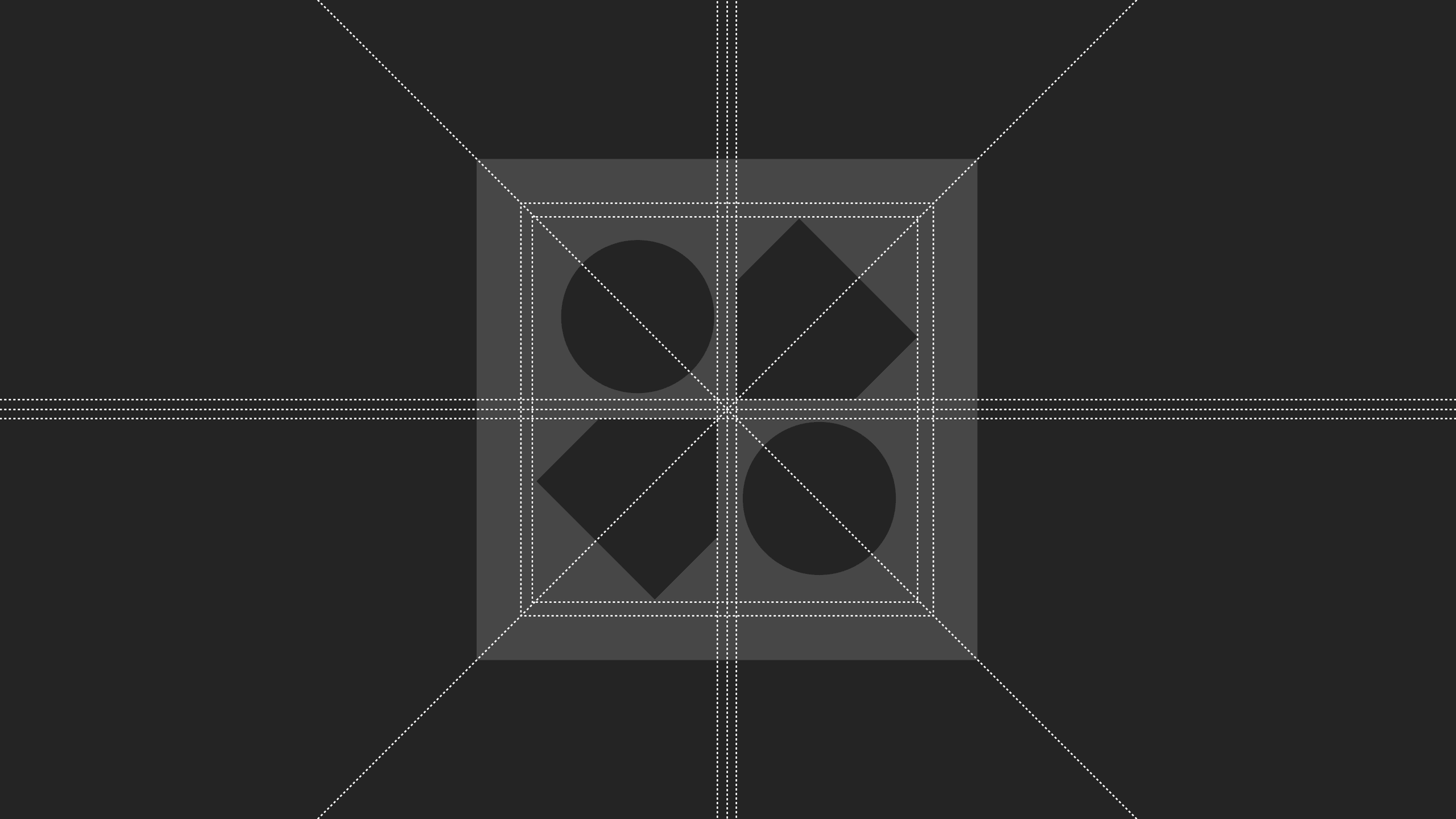
Our wordmark is the cornerstone of the brand system. Its four geometric forms are inspired by gaming consoles, while the blocky construction references the single pixel—the visual origin of console gaming. Drawing from the iconic buttons of game controllers, the color palette pairs a neutral base with vibrant accent colors. Together, they create a brand experience that feels both elevated and playful.


The Identity
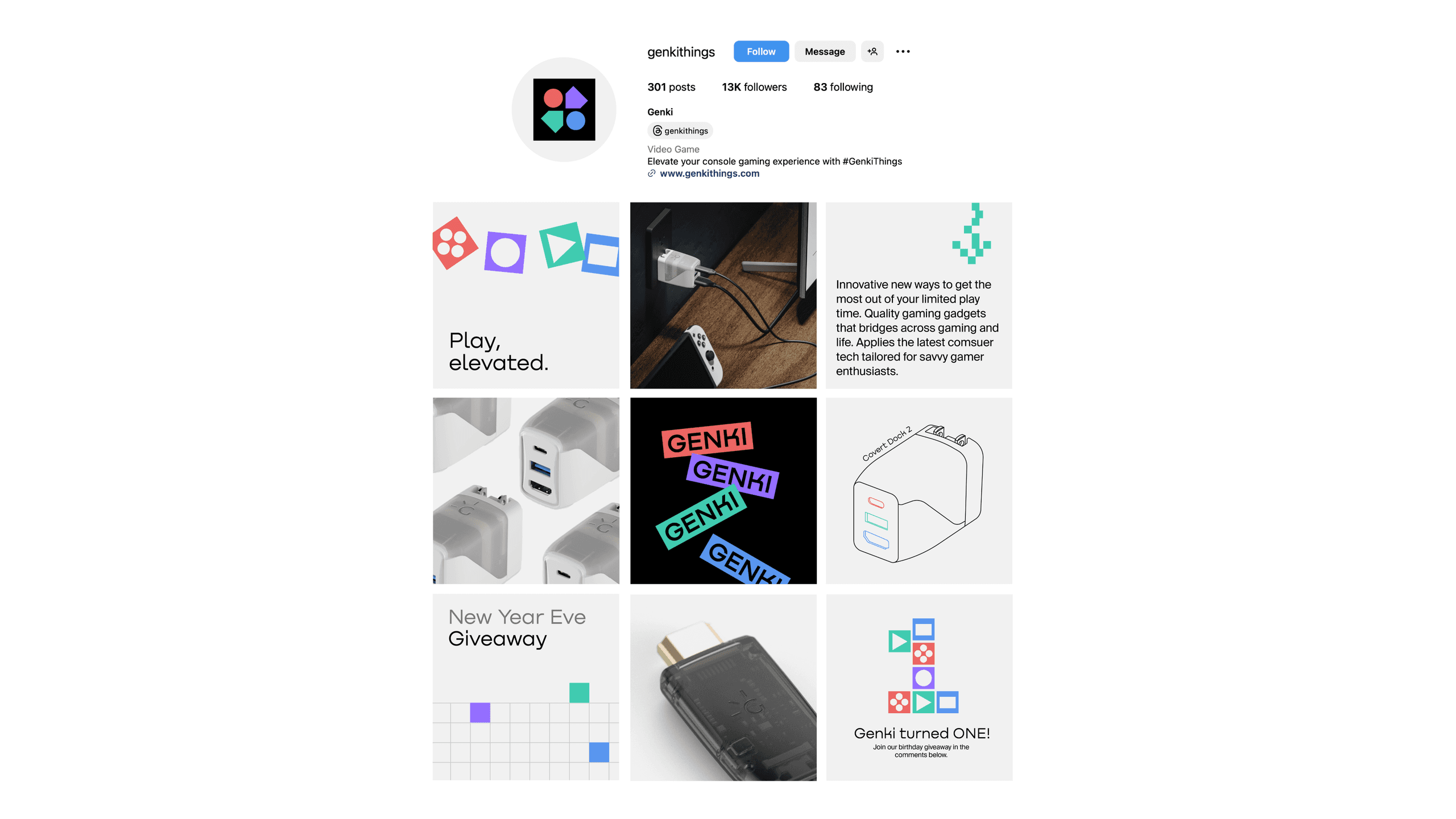
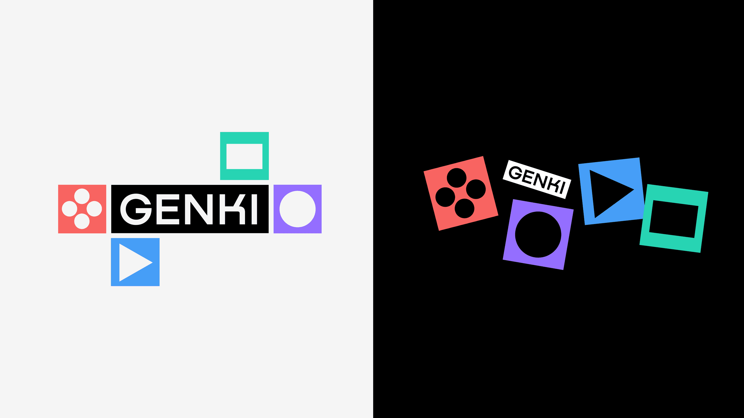
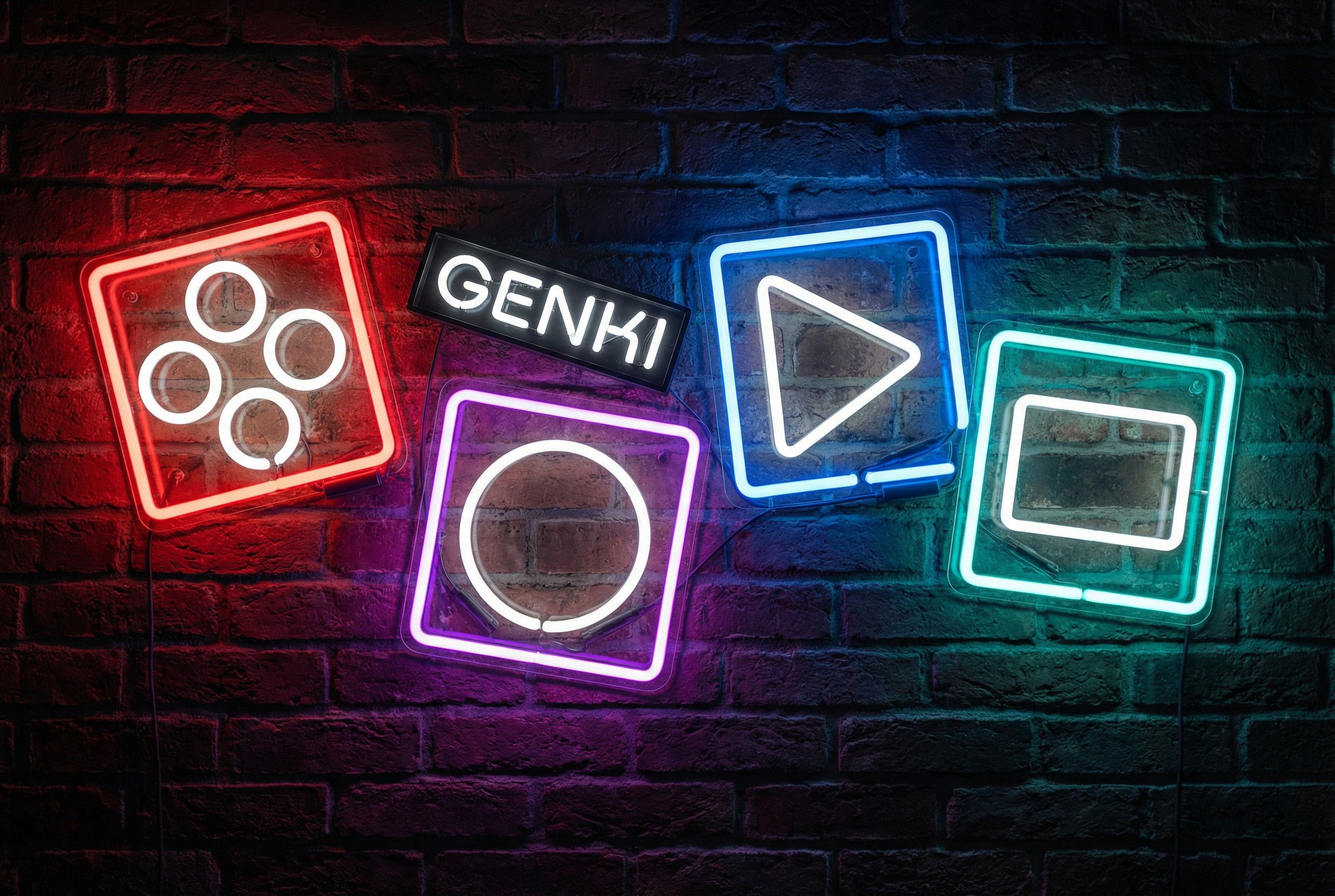
Born out of the logo mark, these four graphic blocks represent the key brand pillars of Genki. Graphic blocks can be freely arranged as a decorative branded element in the composition.
360 Brand Experience
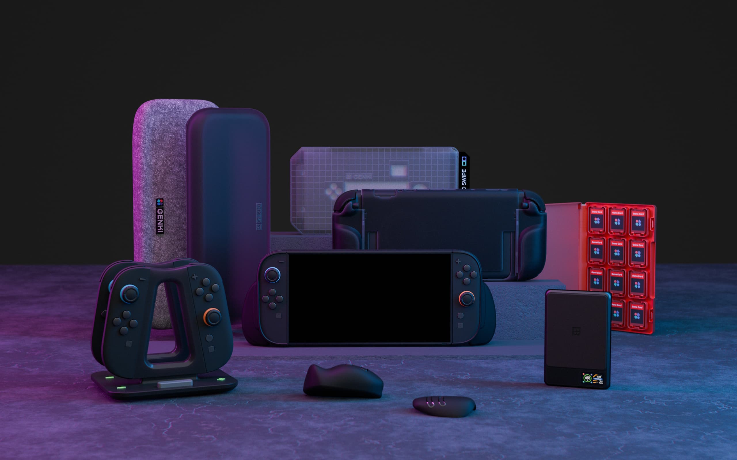
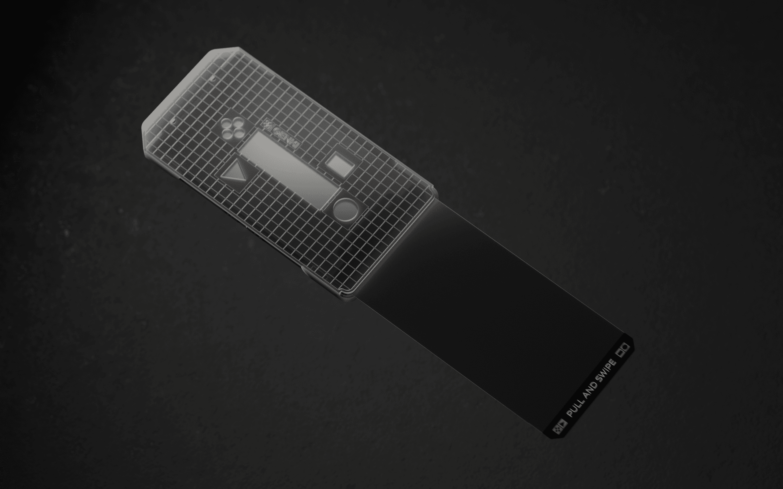
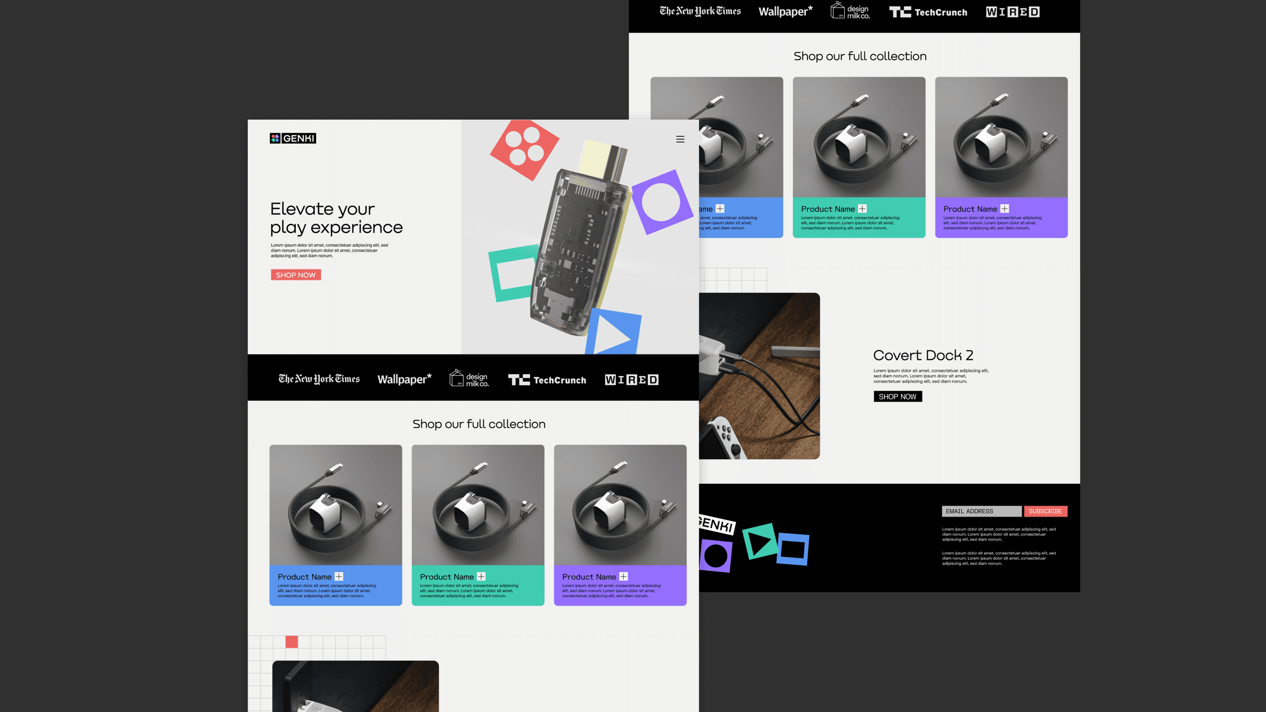
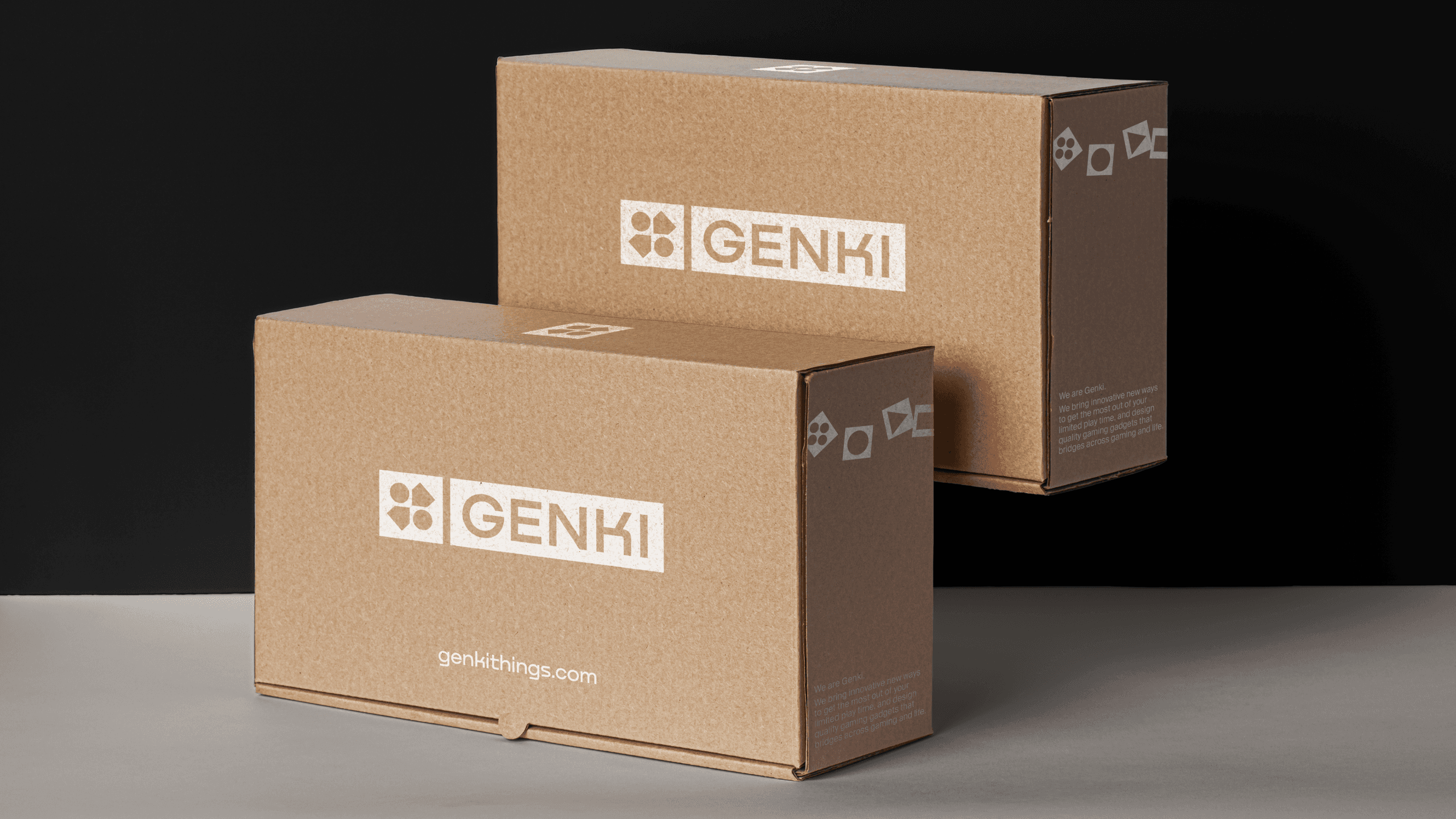
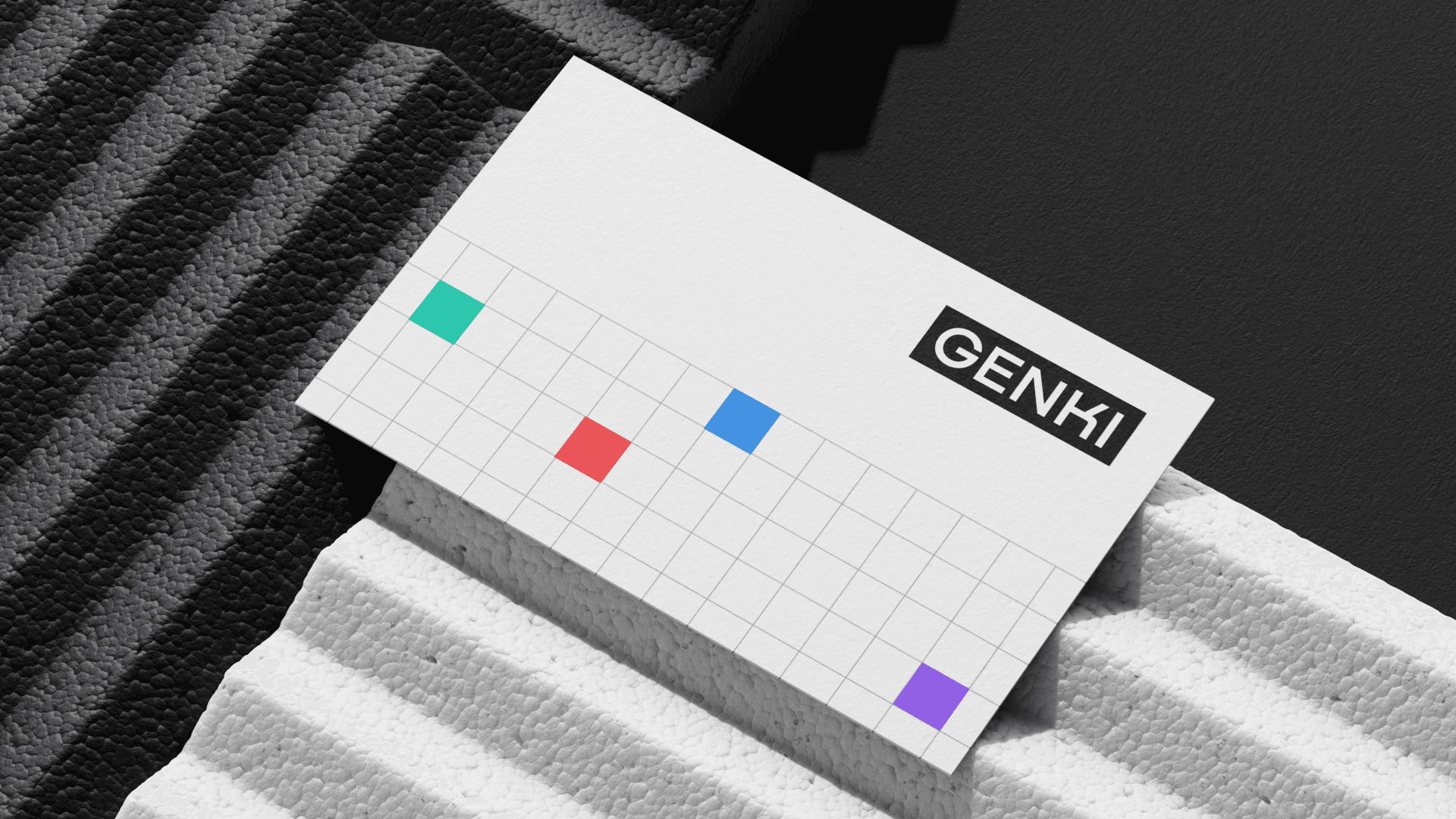
Built around the dual notions of innovation and fun, the brand experience creates a personality that is both bold and consistent across every touchpoint.